Cheez it rebrand

Cheez it rebrand
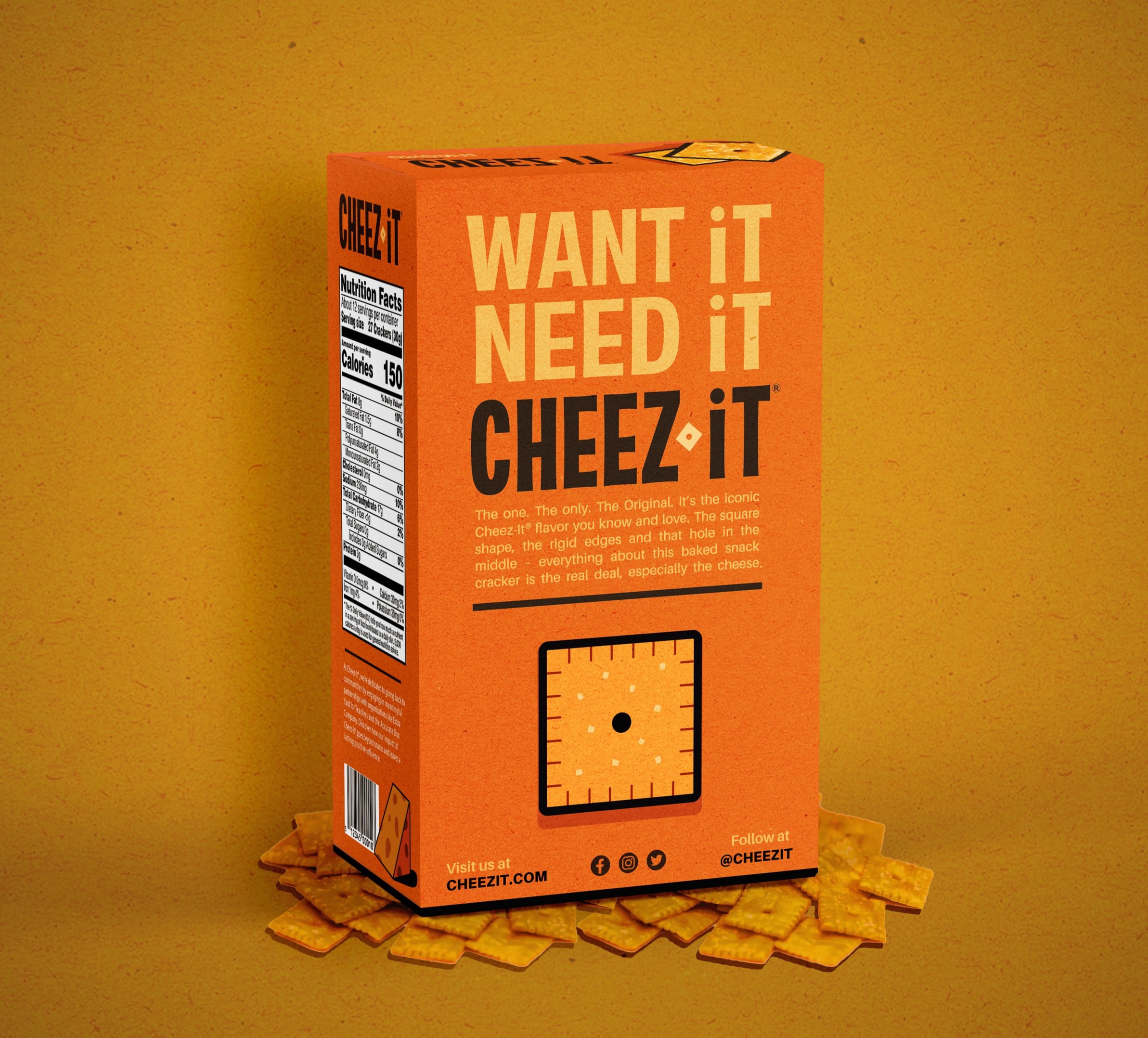
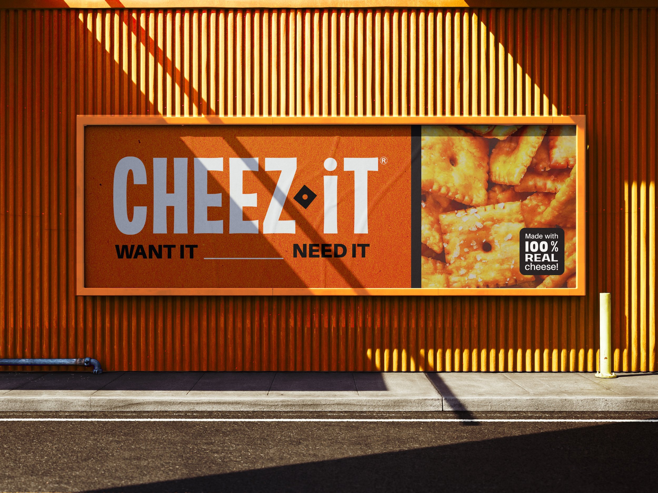
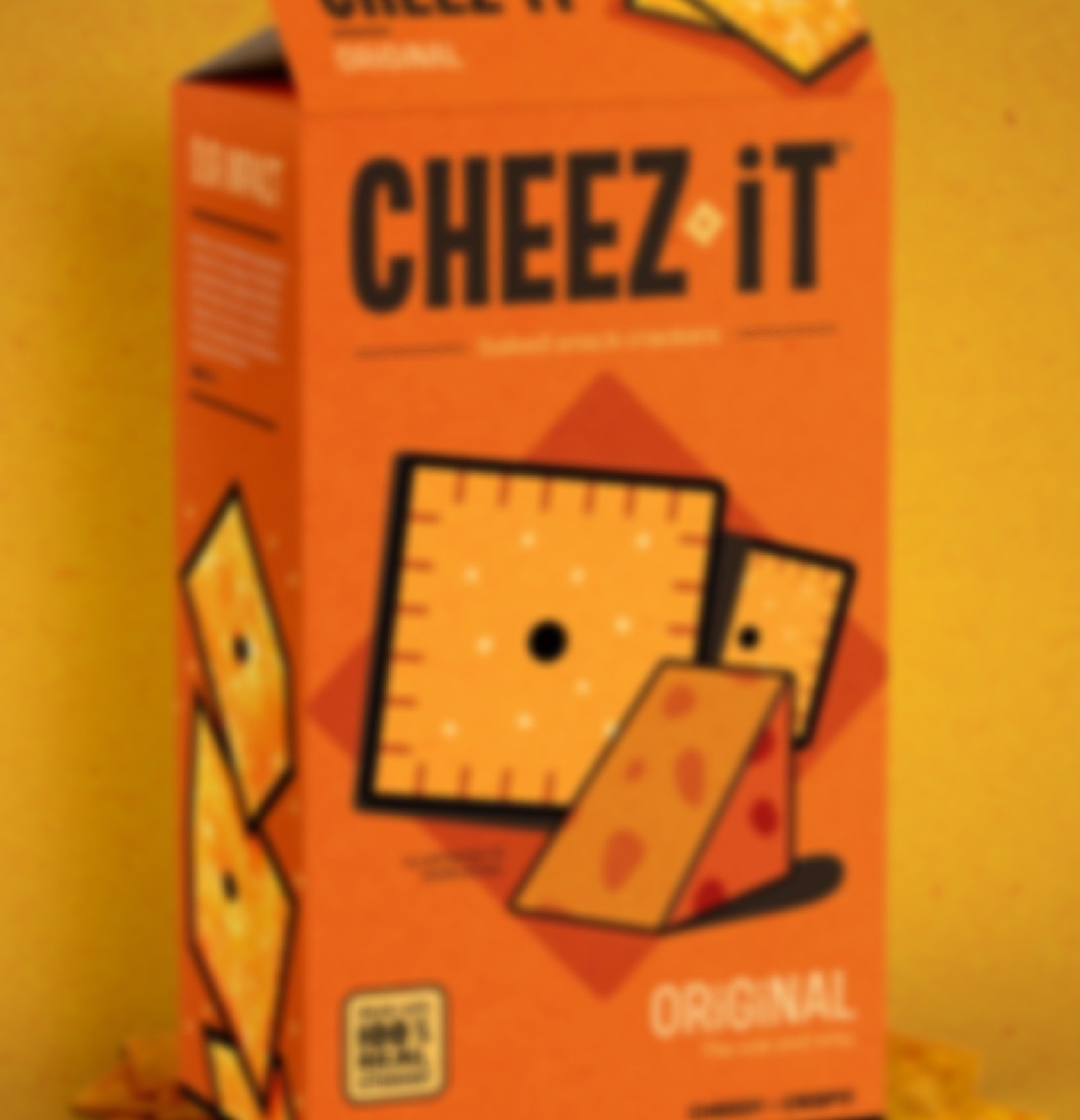
(…Want it! Need it! Cheez it!)

Cheez It is one of the world’s favorite and most recognized snack; but since becoming a designer, I’ve always thought they needed a fresh rebrand. In this design, I wanted to play off some of the colors, imagery, and layout of their current packing but take the design in a more youthful and brighter direction. By taking the orange from the Cheez It itself and incorporating it into the design, it makes the packaging more eye-catching and highlights the unique shade of this cheesy, craveable snacks that makes it so recognizable and by combining illustration with photography, it makes the overall appeal a bit more youthful and clean, catering to cheez-eaters of all ages!
BRANDING | LOGO DESIGN | ADVERTISING DESIGN | ILLUSTRATION